Page 1 of 2
Need an Critic Please
Posted: 27 Jul 2011, 23:54
by Koko_Lion
Right, so... before I slap the topic on another forum more appropriate, I want to see what the folk here thinks.
As two or three members already know, I am changing my business look. This was only to take effect in a couple months but I have decided to do it sooner rather than later.
After endless headaches searching for a name with an available .com or .net domain, I ended up with the following. The name's origin is a little obvious

I am no Michelangelo or Leonardo de Vinci. So any criticism welcome.
Re: Need an Critic Please
Posted: 28 Jul 2011, 00:00
by Anakha56
So...
Where is the name? Or am I being blonde?
Re: Need an Critic Please
Posted: 28 Jul 2011, 00:02
by DAE_JA_VOO
Unless we're both being blonde, I don't see it either

Re: Need an Critic Please
Posted: 28 Jul 2011, 00:04
by Anakha56
Yay, its not just me

. Here I thought night shift has finally taken its toll on me...

Re: Need an Critic Please
Posted: 28 Jul 2011, 00:08
by Koko_Lion
Oh fudge! I am the blonde, sorry...
 TygerTech
Trying to keep it simple, yet professional
Re: Need an Critic Please
Posted: 28 Jul 2011, 13:26
by senile
The name is good but as soon as I saw the logo it reminded me of Tiger wheels & tires even though the colors are different. What products will you be selling?
Re: Need an Critic Please
Posted: 28 Jul 2011, 13:39
by D3PART3D
Would you tattoo her name on your arm

Anyway, The name is simple and easy to remember. Pro.
No-one is going to associate Tech and Tyger. Con.
Re: Need an Critic Please
Posted: 28 Jul 2011, 13:47
by Hman
Looks good IMHO
Re: Need an Critic Please
Posted: 28 Jul 2011, 13:48
by D3PART3D
Oh yes! I think it looks good too
Re: Need an Critic Please
Posted: 28 Jul 2011, 13:58
by Sojourn
In Afrikaans, that immediately made me think you are from the Tyger area, Cape Town region.
Is that the case?
Re: Need an Critic Please
Posted: 28 Jul 2011, 14:10
by Bladerunner
The first question that springs to mind is: "Why 'Tyger' ?"
Re: Need an Critic Please
Posted: 28 Jul 2011, 14:11
by KatrynKat
uhm... he's from KZN...
and Tiger is his gfs nickname/or something....
Re: Need an Critic Please
Posted: 28 Jul 2011, 14:14
by GreyWolf
Crits:
the name: people are stupid and will forever be spelling it "tigertech.net".
the logo: well balanced and good colors, but it is a bit boring and easily forgettable.
Suggestions:
thename: techtiger.com is available
the logo: need more cowbell m8. go to
http://www.logopond.com or
http://www.logomoose.com for some inspiration. But think of the great memorable brands of the world, they all have something VERY unique. eg. Apple, Mercedes, Nike etc. If you don't like a symbol, then you need to make to logo type special eg. coca cola.
Re: Need an Critic Please
Posted: 28 Jul 2011, 16:42
by Koko_Lion
senile wrote:The name is good but as soon as I saw the logo it reminded me of Tiger wheels & tires even though the colors are different. What products will you be selling?
Thanks! Yea, I did see that. Did check often on their site to make sure I didn't make it too alike. I do mostly support and troubleshooting. Trying to push more into other areas like sales, hosting, etc. This is why the new business look. Had a client last week buy about 10 laptops elsewhere because they didn't know they could get the same laptops through me for cheaper.
D3PART3D wrote:Would you tattoo her name on your arm
Anyway, The name is simple and easy to remember. Pro.
No-one is going to associate Tech and Tyger. Con.
Tempting!

GreyWolf wrote:Crits:
the name: people are stupid and will forever be spelling it "tigertech.net".
the logo: well balanced and good colors, but it is a bit boring and easily forgettable.
Suggestions:
thename: techtiger.com is available
the logo: need more cowbell m8. go to
http://www.logopond.com or
http://www.logomoose.com for some inspiration. But think of the great memorable brands of the world, they all have something VERY unique. eg. Apple, Mercedes, Nike etc. If you don't like a symbol, then you need to make to logo type special eg. coca cola.
I did try playing around, but my artistic ability only goes so far. I am even thinking of just paying for a graphics consultant to do it for me. Just worried what the going rates for these guys are?
I checked the techtiger.com domain, seems to be registered under some lady in California? That's according to whois.com though.

Checked out those sites, pretty awsome. I would never be able to do something like that though.
Bladerunner wrote:The first question that springs to mind is: "Why 'Tyger' ?"
As KK answered. But also I been playing with many combination of names that sound ok together. Then finding there is not .com or .net domain. Eventually had to settle on something. Was becoming a little frustrated!
Re: Need an Critic Please
Posted: 28 Jul 2011, 17:22
by Slimshaedy
Where in KZN are you from? I could probably get family discount through my cousins graphic design business...
as for the name, I'm sure all of us can come up with a good, catchy name for the business!
Re: Need an Critic Please
Posted: 28 Jul 2011, 18:32
by Bladerunner
KatrynKat wrote:and Tiger is his gfs nickname/or something....
Oh, of course, silly me. I've just never met her and therefore had no idea.
Koko_Lion wrote:
As KK answered. But also I been playing with many combination of names that sound ok together. Then finding there is not .com or .net domain. Eventually had to settle on something. Was becoming a little frustrated!
Well Tyger is unique I guess, but as someone else stated, since it's kind of plain, you need not only a name but also a logo. Or a mascot. (So either have your girlfriend pose or stick a tiger in there. Alternatively slap some tiger stripes on the name itself.)
Re: Need an Critic Please
Posted: 28 Jul 2011, 19:39
by GreyWolf
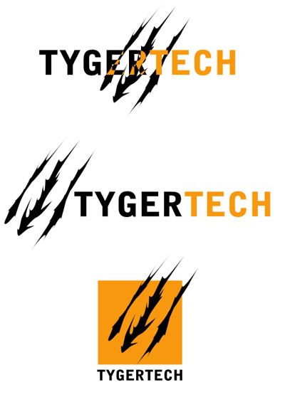
see if you like any of these:
Re: Need an Critic Please
Posted: 28 Jul 2011, 23:05
by Slimshaedy
That 1st logo caught my attention. Did you just make those logos coz they're really really good!
Re: Need an Critic Please
Posted: 28 Jul 2011, 23:24
by GreyWolf
Yes, thank you very much for the complement.
Re: Need an Critic Please
Posted: 29 Jul 2011, 02:39
by Koko_Lion
Wow Greywolf! Thats really awsome! How did you get the text to change colour like that in the first example? I tried doing the exact same thing with the claw symbol. Obviously I had no luck.
Re: Need an Critic Please
Posted: 29 Jul 2011, 06:18
by Tribble
Wow those are brilliant.
I like the bottom one best
Re: Need an Critic Please
Posted: 29 Jul 2011, 06:41
by doo_much
Slimshaedy wrote:That 1st logo caught my attention. Did you just make those logos coz they're really really good!
+1
Re: Need an Critic Please
Posted: 29 Jul 2011, 06:59
by SykomantiS
Yeah, really good GW
I like the 3rd one best.
Re: Need an Critic Please
Posted: 29 Jul 2011, 08:04
by Stuart
Ja, great job on the first one there, GW. A real attention-grabber for sure!
Re: Need an Critic Please
Posted: 29 Jul 2011, 08:07
by Tribble
You could perhaps use a combination of 1 and 3. 3 is more business like and would look great on letterheads and such. The other would look great on your car.